After you have created a chart in Excel, what's the first thing you usually want to do with it? Make the graph look exactly the way you've pictured it in your mind!
In modern versions of Excel, customizing charts is easy and fun. Microsoft has really made a big effort to simplify the process and place the customization options within easy reach. And further on in this tutorial, you will learn some quick ways to add and modify all essential elements of Excel charts.
3 ways to customize charts in Excel
If you've had a chance to read our previous tutorial on how to create a graph in Excel, you already know that you can access the main chart features in three ways:
- Select the chart and go to the Chart Tools tabs (Design and Format) on the Excel ribbon.
- Right-click the chart element you would like to customize, and choose the corresponding item from the context menu.
- Use the chart customization buttons that appear in the top right corner of your Excel graph when you click on it.
Even more customization options can be found on the Format Chart pane that appears on the right of your worksheet as soon as you click More options… in the chart's context menu or on the Chart Tools tabs on the ribbon.
Tip. For immediate access to the relevant Format Chart pane options, double click the corresponding element in the chart.
Armed with this basic knowledge, let's see how you can modify different chart elements to make your Excel graph look exactly the way you'd like it to look.
How to add title to Excel chart
This section demonstrates how to insert the chart title in different Excel versions so that you know where the main chart features reside. And for the rest of the tutorial, we will focus on the most recent versions of Excel.
Add title to chart in Excel
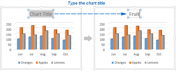
In Excel 2013 - 365, a chart is already inserted with the default "Chart Title". To change the title text, simply select that box and type your title:
You can also link the chart title to some cell on the sheet, so that it gets updated automatically every time the liked cell is updated. The detailed steps are explained in Linking axis titles to a certain cell on the sheet.
If for some reason the title was not added automatically, then click anywhere within the graph for the Chart Tools tabs to appear. Switch to the Design tab, and click Add Chart Element > Chart Title > Above Chart I (or Centered Overlay).

Or, you can click the Chart Elements button in the upper-right corner of the graph, and put a tick in the Chart Title checkbox.
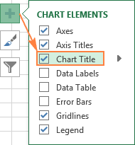
Additionally, you can click the arrow next to Chart Title and chose one of the following options:
- Above Chart - the default option that displays the title at top of the chart area and changes the graph's size.
- Centered Overlay - overlays the centered title on the chart without resizing the graph.
For more options, go to the Design tab > Add Chart Element > Chart Title > More Options.
Or, you can click the Chart Elements button and click Chart Title > More Options…
Clicking the More Options item (either on the ribbon or in the context menu) opens the Format Chart Title pane on the right side of your worksheet, where you can select the formatting options of your choosing.
Add title to chart in Excel 2010 and Excel 2007
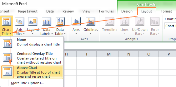
To add a chart title in Excel 2010 and earlier versions, execute the following steps.
- Click anywhere within your Excel graph to activate the Chart Tools tabs on the ribbon.
- On the Layout tab, click Chart Title > Above Chart or Centered Overlay.
Link the chart title to some cell on the worksheet
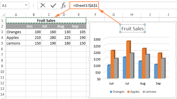
For most Excel chart types, the newly created graph is inserted with the default Chart Title placeholder. To add your own chart title, you can either select the title box and type the text you want, or you can link the chart title to some cell on the worksheet, for example the table heading. In this case, the title of your Excel graph will be updated automatically every time you edit the linked cell.
To link a chart title to a cell, perform the following steps:
- Select the chart title.
- On your Excel sheet, type an equal sign (=) in the formula bar, click on the cell that contains the needed text, and press Enter.
In this example, we are linking the title of our Excel pie chart to the merged cell A1. You can also select two or more cells, e.g. a couple of column headings, and the content of all selected cells will appear in the chart title.
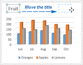
Move the title within the chart
If you want to move the title to a different place within the graph, select it and drag using the mouse:
Remove the chart title
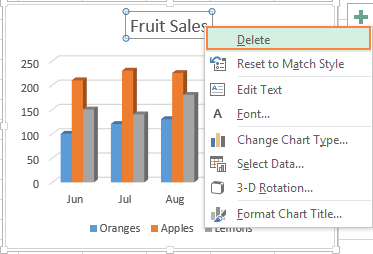
If you don't want any title in your Excel graph, you can delete it in two ways:
- On the Design tab, click Add Chart Element > Chart Title > None.
- On the chart, right-click the chart title, and select Delete in the context menu.
Change font and formatting of chart title
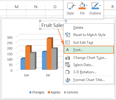
To change the font of the chart title in Excel, right-click the title and choose Font in the context menu. The Font dialog window will pop up where you can choose different formatting options.
For more formatting options, select the title on your chart, go to the Format tab on the ribbon, and play with different features. For example, this is how you can change the title of your Excel graph using the ribbon:
![Find advanced formatting options on the Format tab.] Find advanced formatting options on the Format tab.]](png/format-chart-title.png)
In the same way, you can change the formatting of other chart elements such as axis titles, axis labels and chart legend.
For more information about chart title, please see How to add titles to Excel charts.
Customizing axes in Excel charts
For most chart types, the vertical axis (aka value or Y axis) and horizontal axis (aka category or X axis) are added automatically when you make a chart in Excel.
You can show or hide chart axes by clicking the Chart Elements button ![]() , then clicking the arrow next to Axes, and then checking the boxes for the axes you want to show and unchecking those you want to hide.
, then clicking the arrow next to Axes, and then checking the boxes for the axes you want to show and unchecking those you want to hide.
For some graph types, such as combo charts, a secondary axis can be displayed:

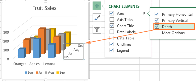
When creating 3-D charts in Excel, you can make the depth axis to appear:
You can also make different adjustments to the way that different axis elements are displayed in your Excel graph (the detailed steps follow below):
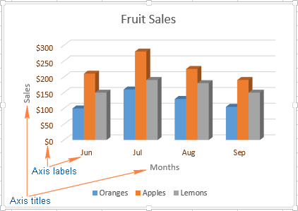
Add axis titles to a chart
When creating graphs in Excel, you can add titles to the horizontal and vertical axes to help your users understand what the chart data is about. To add the axis titles, do the following:
- Click anywhere within your Excel chart, then click the Chart Elements button and check the Axis Titles box. If you want to display the title only for one axis, either horizontal or vertical, click the arrow next to Axis Titles and clear one of the boxes:
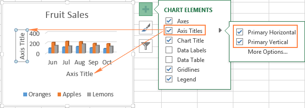
- Click the axis title box on the chart, and type the text.
To format the axis title, right-click it and select Format Axis Title from the context menu. The Format Axis Title pane will appear with lots of formatting options to choose from. You can also try different formatting options on the Format tab on the ribbon, as demonstrated in Formatting the chart title.
Link axis titles to a certain cell on the sheet
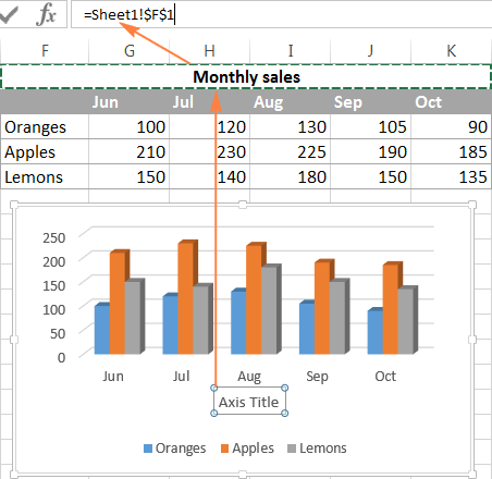
As is the case with chart titles, you can link an axis title to some cell on your worksheet to have it automatically updated every time you edit the corresponding cells on the sheet.
To link an axis title, select it, then type an equal sign (=) in the formula bar, click on the cell you want to link the title to, and press the Enter key.
Change the axis scale in the chart
Microsoft Excel automatically determines the minimum and maximum scale values as well as the scale interval for the vertical axis based on the data included in the chart. However, you can customize the vertical axis scale to better meet your needs.
1. Select the vertical axis in your chart, and click the Chart Elements button ![]() .
.
2. Click the arrow next to Axis, and then click More options… This will bring up the Format Axis pane.
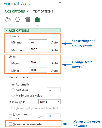
3. On the Format Axis pane, under Axis Options, click the value axis that you want to change and do one of the following:
- To set the starting point or ending point for the vertical axis, enter the corresponding numbers in the Minimum or Maximum
- To change the scale interval, type your numbers in the Major unit box or Minor unit box.
- To set the axis scaling back to Auto, click the Reset button next to the unit box.
- To reverse the order of the values, put a tick in the Values in reverse order box.
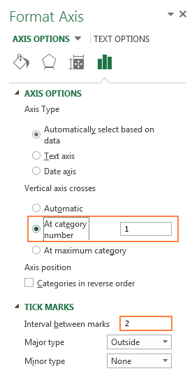
Because a horizontal axis displays text labels rather than numeric intervals, it has fewer scaling options that you can change. However, you can alter the number of categories to display between tick marks, the order of categories, and the point where the two axes cross:
Change the format of axis values
If you want the numbers of the value axis labels to display as currency, percentage, time or in some other format, right-click the axis labels, and choose Format Axis in the context menu. On the Format Axis pane, click Number and choose one of the available format options:

Tip. To revert back to the original number formatting (the way the numbers are formatted in your worksheet), check the Linked to source box.
If you don't see the Number section in the Format Axis pane, make sure you've selected a value axis (usually the vertical axis) in your Excel chart.
Adding data labels to Excel charts
To make your Excel graph easier to understand, you can add data labels to display details about the data series. Depending on where you want to focus your users' attention, you can add labels to one data series, all the series, or individual data points.
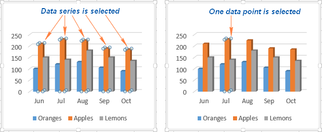
- Click the data series you want to label. To add a label to one data point, click that data point after selecting the series.
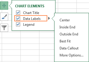
- Click the Chart Elements button, and select the Data Labels option.
For example, this is how we can add labels to one of the data series in our Excel chart:

For specific chart types, such as pie chart, you can also choose the labels location. For this, click the arrow next to Data Labels, and choose the option you want. To show data labels inside text bubbles, click Data Callout.
How to change data displayed on labels
To change what is displayed on the data labels in your chart, click the Chart Elements button > Data Labels > More options… This will bring up the Format Data Labels pane on the right of your worksheet. Switch to the Label Options tab, and select the option(s) you want under Label Contains:

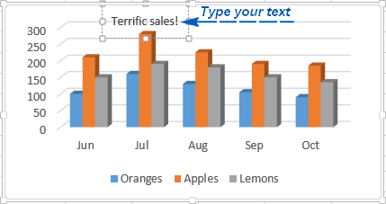
If you want to add your own text for some data point, click the label for that data point and then click it again so that only this label is selected. Select the label box with the existing text and type the replacement text:
If you decide that too many data labels clutter your Excel graph, you can remove any or all of them by right-clicking the label(s) and selecting Delete from the context menu.
Data label tips:
- To change the position of a given data label, click it and drag to where you want using the mouse.
- To change the labels' font and background color, select them, go to the Format tab on the ribbon, and choose the formatting options you want.
Moving, formatting or hiding the chart legend
When you create a chart in Excel, the default legend appears at the bottom of the chart, and to the right of the chart in Excel 2010 and earlier versions.
To hide the legend, click the Chart Elements button ![]() in the upper-right corner of the chart and uncheck the Legend box.
in the upper-right corner of the chart and uncheck the Legend box.
To move the chart legend to another position, select the chart, navigate to the Design tab, click Add Chart Element > Legend and choose where to move the legend. To remove the legend, select None.
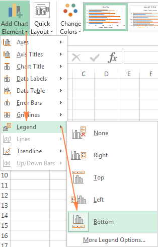
Another way to move the legend is to double-click on it in the chart, and then choose the desired legend position on the Format Legend pane under Legend Options.
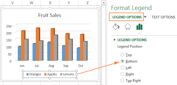
To change the legend's formatting, you have plenty of different options on the Fill & Line and Effects tabs on the Format Legend pane.
Showing or hiding the gridlines on the Excel chart
In Excel 2013, 2016 and 2019, turning the gridlines on or off is a matter of seconds. Simply click the Chart Elements button and either check or uncheck the Gridlines box.
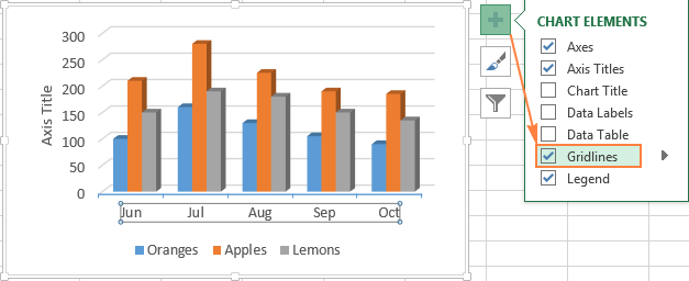
Microsoft Excel determines the most appropriate gridlines type for your chart type automatically. For example, on a bar chart, major vertical gridlines will be added, whereas selecting the Gridlines option on a column chart will add major horizontal gridlines.
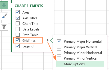
To change the gridlines type, click the arrow next to Gridlines, and then choose the desired gridlines type from the list, or click More Options… to open the pane with advanced Major Gridlines options.
Hiding and editing data series in Excel graphs
When a lot of data is plotted in your chart, you may want to temporary hide some data series so that you could focus only on the most relevant ones.
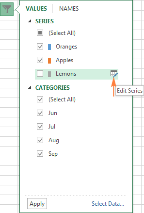
To do this, click the Chart Filters button ![]() on the right of the graph, uncheck the data series and/or categories you want to hide, and click Apply.
on the right of the graph, uncheck the data series and/or categories you want to hide, and click Apply.
To edit a data series, click the Edit Series button to the right of the data series. The Edit Series button appears as soon as you hover the mouse on a certain data series. This will also highlight the corresponding series on the chart, so that you could clearly see exactly what element you will be editing.
Changing chart type and style
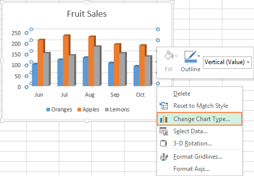
If you decide that the newly created graph is not well-suited for your data, you can easily change it to some other chart type. Simply select the existing chart, switch to the Insert tab and choose another chart type in the Charts group.
Alternatively, you can right-click anywhere within the graph and select Change Chart Type… from the context menu.
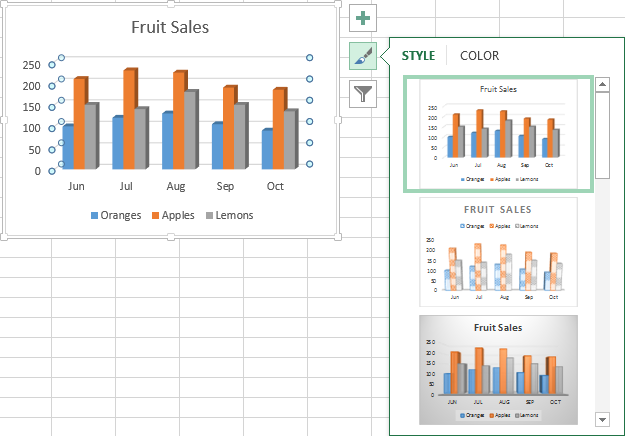
To quickly change the style of the existing graph in Excel, click the Chart Styles button ![]() on the right of the chart and scroll down to see the other style offerings.
on the right of the chart and scroll down to see the other style offerings.
Or, choose a different style in the Charts Styles group on the Design tab:

Changing chart colors
To change the color theme of your Excel graph, click the Chart Styles button, switch to the Color tab and select one of the available color themes. Your choice will be immediately reflected in the chart, so you can decide whether it will look well in new colors.
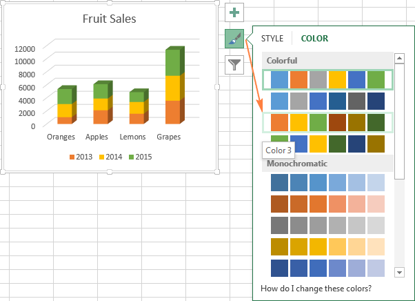
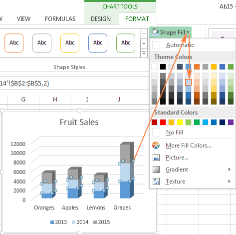
To choose the color for each data series individually, select the data series on the chart, go to the Format tab > Shape Styles group, and click the Shape Fill button:
How to swap X and Y axes in the chart
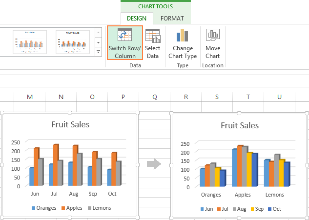
When you make a chart in Excel, the orientation of the data series is determined automatically based on the number of rows and columns included in the graph. In other words, Microsoft Excel plots the selected rows and columns as it considers the best.
If you are not happy with the way your worksheet rows and columns are plotted by default, you can easily swap the vertical and horizontal axes. To do this, select the chart, go to the Design tab and click the Switch Row/Column button.
How to flip an Excel chart from left to right
Have you ever made a graph in Excel only to find out that data points appear backwards from what you expected? To rectify this, reverse the plotting order of categories in a chart as shown below.
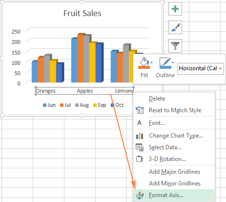
Right click on the horizontal axis in your chart and select Format Axis… in the context menu.
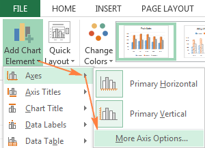
If you prefer working with the ribbon, go to the Design tab and click Add Chart Element > Axes > More Axis Options…
Either way, the Format Axis pane will show up, you navigate to the Axis Options tab and select the Categories in reverse order option.
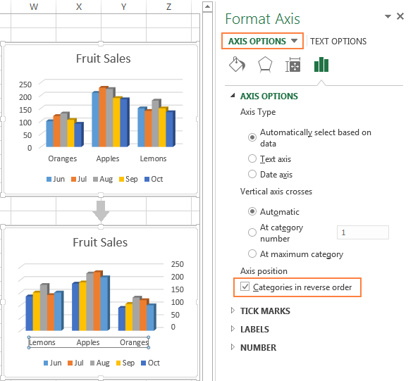
Apart from flipping your Excel chart from left to right, you can also change the order of categories, values, or series in your graph, reverse the plotting order of values, rotate a pie chart to any angle, and more. The following tutorial provides the detailed steps on how to do all this: How to rotate charts in Excel.
This is how you customize charts in Excel. Of course, this article has only scratched the surface of Excel chart customization and formatting, and there is much more to it. In the next tutorial, we are going to make a chart based on data from several worksheets. And in the meanwhile, I encourage you to review the links at the end of this article to learn more.
 by
by
43 comments
Please, how to put the X axis at the top of a bar chart, with the y axis showing depths in a soil profile i.e. starting with 0.0-0.20 m at the top going down to 1.8-2.0 m at the bottom? The X axis is to show a soil property such as penetrometer resistance. Thank you.
Hello, I am using Excel Version 16.64 and I am currently creating a box and whisker plot. Somehow the program does not display the option "major/minor units" under "axis options" where these options are supposed to be. The only option I have is to set the minimum and maximum bound. I have grouped my data as data category "number". I do not have any text in my data. Unfortunately I am therefore not able to change the scaling of my Y axis on individual basis. I am happy for any help.
I am creating a line chart. I prepared the table for the horizontal data axis and the chart data. The data transfers to the chart just fine but excel won't use the dates in the table. What am I doing wrong?
Not in Design tab. Was in Layout tab.
Hello there.
I copied a chart and broke the link intentionally. Now I want to change the axis label text while it has no link. Is there any way to do it?
Hi,
I am currently working on Excel version 97-2003 worksheet. Am experiencing difficulties with one of my worksheet tab graph. I've recently changed the formula on my Select Data Source
From (Example: ='Front5, Left5, Right5 & Back. classroom errors'!$A$91:$A$127)
To (Example: ='Front5, Left5, Right5 & Back. classroom errors'!$A$92:$A$128)
Now my graph is completely screwed up. The Series now stop @ December 2019 instead the month of March 2020. One I changed my Format Axis date, The line on the graph stop's 3 months earlier (December) and I cannot seem to change it even though all formulas are updated. I need help figuring this problem out. Unable to upload a picture example of the graph. Please email me
Hi,
How can I update automatically text in legend daily without selecting "Select Data" option.
Svetlana, thank you for the guidelines! I tried, without success, to add a symbol after the values in the axis label. Used custom, added code. Maybe this is impossible?
Hi Georgi,
Is my understanding correct that you are trying to customize the axis labels? If so, here's how I usually do this:
1. In an empty column (somewhere at the end of a sheet, out of view), type the labels exactly how you want them to appear in the chart.
2. In the chart, right-click the axis and pick "Select data" from the context menu.
3. On the right pane, under "Horizontal (Category) Axis Labels", click Edit.
4. Select the range with your custom labels and click OK.
Done.
Hi, I made column clustered chart with two clustered group (male and female) for 40 years on the same graph. That is, male and female clustered bars for 4o years on x-axis. However, the bar for male did not show for the first year. How can I do this?
Thanks,
Thank you very much for these limpid explanations. Extremely useful and well presented.
Your explanation and flow of information attracted too much.
Here I have one question. How to fix the major grids for the data set.
For example, using this data
0.015625
0.03125
0.0625
0.125
0.25
0.5
1
How can you insert a title in a excle chart
Hello, first thanks for this blog it has been very helpful from lately, I have a question regarding 2D Surface area graphs, as I created the graph, the legends are created automatically giving different colored rangers from (0-10 , 10-20 , 20-30, and 30-40) I waant to change these legend ranges (excel 2010) can you help me with this please? Thanks!
For the legend, the labels default to 'Series 1', ,Series 2' and so on. How can specific names be allocated to replace 'Series 1', 'Series 2' and so on?
Hi Des,
Here are the steps to change the legend labels:
1. Right-click the legend, and click Select Data…
2. In the Select Data Source box, click on the legend entry you want to change, and then click the Edit button.
3. The Edit Series dialog window will show up. The Series name box contains the address of the cell from which Excel pulls the label. You can either type the desired text in that cell, and the corresponding label in the chart will update automatically, or you can delete the existing reference and type the reference to another cell that contains the data you want to use as the label.
I have constructed a histogram in excel using the pivot table. I would like to add to the graph of the regular histogram, the cumulative frequency graph. Should I add to the pivot table a cumulative frequency column? On ablebits.com -how-to-create-a-histogram-using-the-pivottable. At the very end, you present the histogram for the frequency distribution with the cumulative frequency distribution added to the graph of the histogram but do not show the steps on how to add the cumulative frequency distribution to the graph using the same pivottable. Your reply is appreciated, Thank You
Hi
Can you write a macro or formula to include the data into the legend next to the series name?
I know that we can change the position of Data Labels but Can we change the colour of Data Labels?
Hi Supriya,
Sure, you can. Here's how:
- Click on data labels in the chart to select them.
- Go to the Chart Tools > Format tab.
- In the WordArt Styles group, click the Text Fill button and select the desired color.
I have a composite chart where there are two legends on Y-axis. February 1 to 28 and March 1 to 31. Is there a way to have different colors for each of these rows in the legend?
how to display the two titles in legends
country female | men |
10-14 | 15-24 | 25-30 | 10-14 | 15-24 | 25-30 |
Bangladesh 10 | 12.6 |
Bhutan
India
Indonesia
Nepal
Sri Lanka
hey - great article! what do you do when you cannot edit the Legend Entry in the Select Data Source? I can see the buttons to click on to Edit/Add/Remove but they remain greyed out...?
Is there a way to make the reverse value of axis order dynamic? Thanks to all these great blog entries, I have a dynamic chart that displays different data based on a pulldown option (counts or amounts). Counts display in the helper table as positive integers, and amounts display as negative decimals, with custom format to display as currency.
When I graph the data, the vertical axis shows proper logical stacking (0 upward to high value) for the counts, but amounts descend from the top (0) down to the low maximum (-$1M). If I choose inverse order when graphing the amounts, switching back to counts now shows the counts descending from the top of the chart.
I'd like to only invert the order when the pulldown reads "amounts" (or values are negative). Negating the helper table values can be troublesome, since I use the negative amount to format the vertical axis (positives display as integers, negatives display as currency).
Thank you all so much for the blog.
Good Day I am trying to insert an exstra naam in my chart witch I have colour coded next to my chart I have little blocks witch has got n difrent colour with a name next to it how do I insert the name and in the coloum were I put the amounts
Im trying to save a chart as a template to a set size, but when I open the chart from templates it reverts back to standard size, how can I fix this?
Does anyone know how to stop the removal of formatting when saving as text in another file?
not helpful at all
I have a bar graph showing actual sales, with a line for the target. I am showing data for the entire year, even though we have only 4 months completed - the reason for this is to show the line as to where we are at to target. (we do this for every salesperson so they know where they are at to target.
what I would like to do, is fade out the bars for the months that we haven't got to yet. Or change the formatting of the remaining months from my data, so that it would look different for those remaining months.
I don't think I can break up the series to show shaded bars for the remaining months - so how can I get the chart to pick up the formatting from the source? (ie. I changed the colour of the remaining months and bolded)
Typo Correction for above: (...this is a horizontal bar chart)...
In Excel, how do you put the percent along the top (...this is a horizontal bar chart) and then add data labels and make the data labels numeric (...not the percentage)?
5% 10% 15% 20%
A ████████ 9
B █ 3
C ████████████ 12
D ████ 6
In Excel how do you put the percent along the top (...the is horizontal bar chart) and then add data labels and make the number (...not the percent)?
5% 10% 15%
A ████ 9
B █ 3
C ████████ 12
D ██ 6
Can you tell me how to remove non numeric data when i try to do histogram in excel 2016. I have row with date and another are with numbers...i look on internet but i didn`t find the right way :) And i don`t have empty cells or with 0... Format the row in Date and Numeric...
Thank you in advance :)
Hi there,
Is there any way to change the chart axis title from all upper case to lower case as the upper case comes by default when I create 'Line with marker' Line graph in excel.
Thanks
Bikash
i want to create a single line graph with different x axis values like (18,20,25,30,35,45,55,65). generally it is creating chart with same interval like(5,10,15,20). Thanks in advance
Hello
thanks much. I have an additional question: How can the axis be fixed and not change when being copied and other data is being entered?
e.g. I have one graph showing the amount of people in street A, axis bound goes from 1 to 100. I copy this graph (in order to keep the layout) and enter the amount of people in street B, axis bound modifies itself automatically from 1 to 5, but I want it to stay from 1 to 100.
How can I do this?
thank you!
OK here is the answer an excel guru found for me. The Bounds will only appear in the Format Axis drop down if there are no n/a or multiple data types in the source data; ie dates and numbers. Once I cleaned the data problem solved.
Hi I am stumped. I have graphs in the same file on several different tabs. The horizntal axis is dates that I want to be able to select a minimum and maximum at will. For the graph on one tab when I right click on the horizontal axis I can see the "Bounds" field with min and max listed under Axis Options so it is easy to change the min and max date fields.
For the graph on the next tab, I cannot see the "Bounds" listed under Axis Options. Gotta believe I am missing a simple setting somewhere.
Thanks in advance for your help!
Hi,
How can I change text in the legend?
Hi Arpaporn,
To change the text in the chart legend, do the following:
1. Right-click the legend, and choose Select Data in the context menu.
2. In the Select Data Source dialog box, under Legend Entries (Series), select the legend entry that you want to change, and click the Edit button, which resides above the list of the legend entries.
3. In the Series Name box, type either the reference to the cell that contains the desired text, or the legend name that you want to use.
Thank you very much, Svetlana. I now can change the text in the chart legend. :-)
Hi Svetlana
I like the way you use arrows to show the sequence of clicks needed to get to a menu item. I am going to borrow that idea!
Thank you
Bruce
Wao, Thank alot..