If you were asked to name three key components of Microsoft Excel, what would they be? Most likely, spreadsheets to input data, formulas to perform calculations and charts to create graphical representations of various data types.
I believe, every Excel user knows what a chart is and how to create it. However, one graph type remains opaque to many - the Gantt chart. This short tutorial will explain the key features of the Gantt diagram, show how to make a simple Gantt chart in Excel, where to download advanced Gantt chart templates and how to use the online Project Management Gantt Chart creator.
What is a Gantt chart?
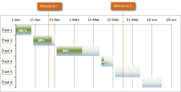
The Gantt chart bears a name of Henry Gantt, American mechanical engineer and management consultant who invented this chart as early as in 1910s. A Gantt diagram in Excel represents projects or tasks in the form of cascading horizontal bar charts. A Gantt chart illustrates the breakdown structure of the project by showing the start and finish dates as well as various relationships between project activities, and in this way helps you track the tasks against their scheduled time or predefined milestones.
How to make Gantt chart in Excel
Regrettably, Microsoft Excel does not have a built-in Gantt chart template as an option. However, you can quickly create a Gantt chart in Excel by using the bar graph functionality and a bit of formatting.
Please follow the below steps closely and you will make a simple Gantt chart in under 3 minutes. We will be using Excel 2010 for this Gantt chart example, but you can simulate Gantt diagrams in any version of Excel 2013 through Excel 365 in the same way.
1. Create a project table
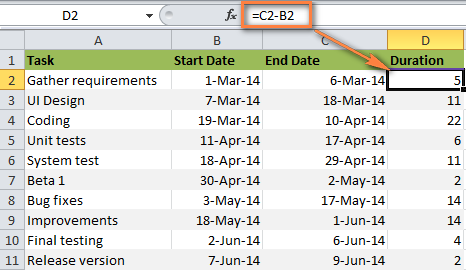
You start by entering your project's data in an Excel spreadsheet. List each task is a separate row and structure your project plan by including the Start date, End date and Duration, i.e. the number of days required to complete the tasks.
Tip. Only the Start date and Duration columns are necessary for creating an Excel Gantt chart. If you have Start Dates and End Dates, you can use one of these simple formulas to calculate Duration, whichever makes more sense for you:
Duration = End Date - Start Date
Duration = End date - Start date + 1
2. Make a standard Excel Bar chart based on Start date
You begin making your Gantt chart in Excel by setting up a usual Stacked Bar chart.
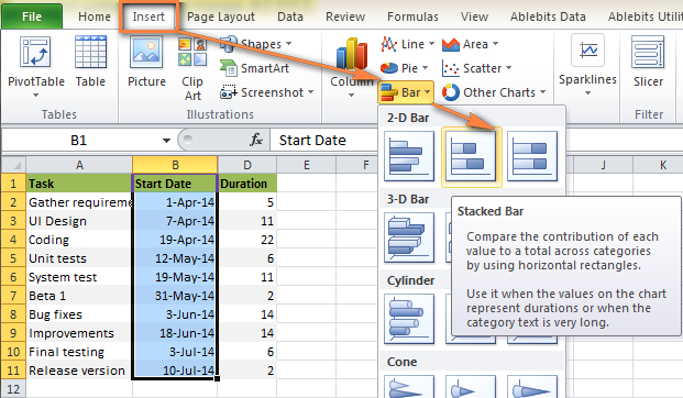
- Select a range of your Start Dates with the column header, it's B1:B11 in our case. Be sure to select only the cells with data, and not the entire column.
- Switch to the Insert tab > Charts group and click Bar.
- Under the 2-D Bar section, click Stacked Bar.
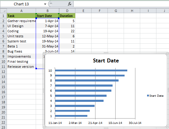
As a result, you will have the following Stacked bar added to your worksheet:
Note. Some other Gantt Chart tutorials you can find on the web recommend creating an empty bar chart first and then populating it with data as explained in the next step. But I think the above approach is better because Microsoft Excel will add one data series to the chart automatically, and in this way save you some time.
3. Add Duration data to the chart
Now you need to add one more series to your Excel Gantt chart-to-be.
- Right-click anywhere within the chart area and choose Select Data from the context menu.
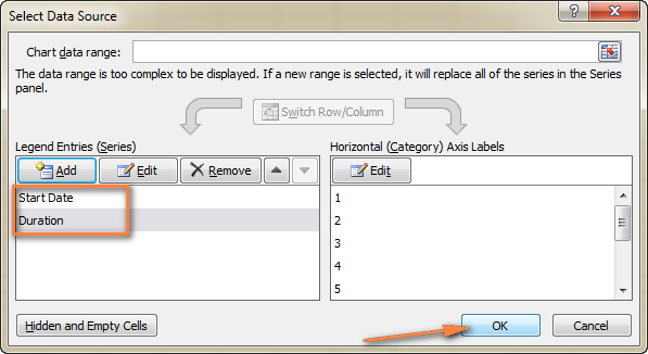
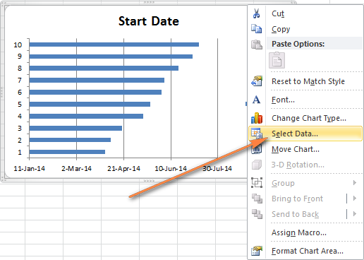 The Select Data Source window will open. As you can see in the screenshot below, Start Date is already added under Legend Entries (Series). And you need to add Duration there as well.
 - Click the Add button to select more data (Duration) you want to plot in the Gantt chart.
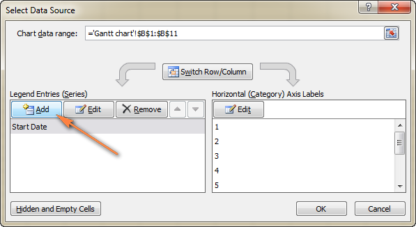
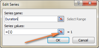
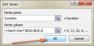
- The Edit Series window opens and you do the following:
- In the Series name field, type "Duration" or any other name of your choosing. Alternatively, you can place the mouse cursor into this field and click the column header in your spreadsheet, the clicked header will be added as the Series name for the Gantt chart.
- Click the range selection icon
 next to the Series Values field.
- A small Edit Series window will open. Select your project Duration data by clicking on the first Duration cell (D2 in our case) and dragging the mouse down to the last duration (D11). Make sure you have not mistakenly included the header or any empty cell.
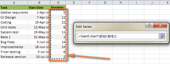
- Click the Collapse Dialog icon to exit this small window. This will bring you back to the previous Edit Series window with Series name and Series values filled in, where you click OK.
- Now you are back at the Select Data Source window with both Start Date and Duration added under Legend Entries (Series). Simply click OK for the Duration data to be added to your Excel chart.
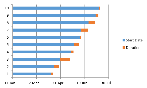
 The resulting bar chart should look similar to this:
4. Add task descriptions to the Gantt chart
Now you need to replace the days on the left side of the chart with the list of tasks.
- Right-click anywhere within the chart plot area (the area with blue and orange bars) and click Select Data to bring up the Select Data Source window again.
- Make sure the Start Date is selected on the left pane and click the Edit button on the right pane, under Horizontal (Category) Axis Labels.
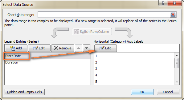
- A small Axis Label window opens and you select your tasks in the same fashion as you selected Durations in the previous step - click the range selection icon
 , then click on the first task in your table and drag the mouse down to the last task. Remember, the column header should not be included. When done, exit the window by clicking on the range selection icon again.
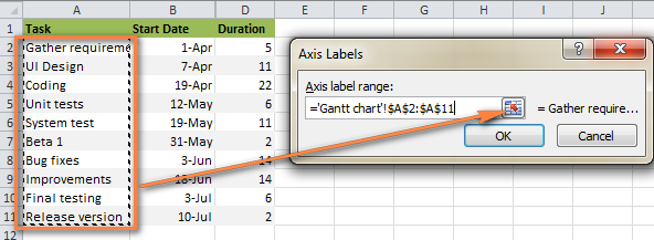
- Click OK twice to close the open windows.
- Remove the chart labels block by right-clicking it and selecting Delete from the context menu.
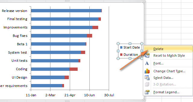 At this point your Gantt chart should have task descriptions on the left side and look something like this:
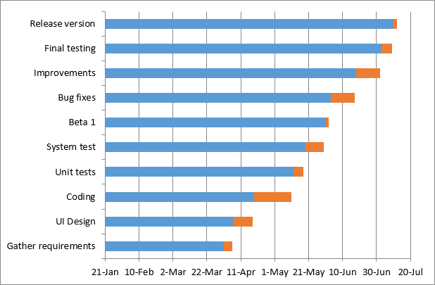
5. Transform the bar graph into the Excel Gantt chart
What you have now is still a stacked bar chart. You have to add the proper formatting to make it look more like a Gantt chart. Our goal is to remove the blue bars so that only the orange parts representing the project's tasks will be visible. In technical terms, we won't really delete the blue bars, but rather make them transparent and therefore invisible.
- Click on any blue bar in your Gantt chart to select them all, right-click and choose Format Data Series from the context menu.
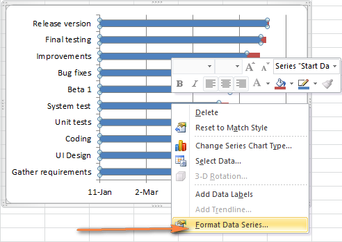
- The Format Data Series window will show up and you do the following:
- Switch to the Fill tab and select No Fill.
- Go to the Border Color tab and select No Line.
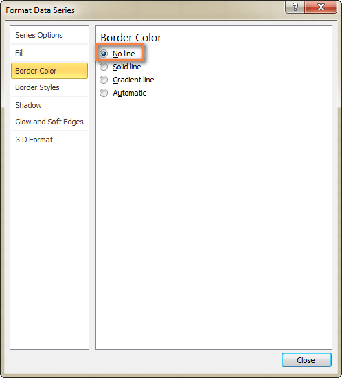
Note. You do not need to close the dialog because you will use it again in the next step.
- As you have probably noticed, the tasks on your Excel Gantt chart are listed in reverse order. And now we are going to fix this.Click on the list of tasks in the left-hand part of your Gantt chart to select them. This will display the Format Axis dialog for you. Select the Categories in reverse order option under Axis Options and then click the Close button to save all the changes.
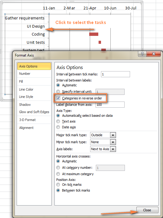
The results of the changes you have just made are:
- Your tasks are arranged in a proper order on a Gantt chart.
- Date markers are moved from the bottom to the top of the graph.
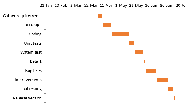
Your Excel chart is starting to look like a normal Gantt chart, isn't it? For example, my Gantt diagram looks like this now:
6. Improve the design of your Excel Gantt chart
Though your Excel Gantt chart is beginning to take shape, you can add a few more finishing touches to make it really stylish.
- Remove the empty space on the left side of the Gantt chart.As you remember, originally the starting date blue bars resided at the start of your Excel Gantt diagram. Now you can remove that blank white space to bring your tasks a little closer to the left vertical axis.
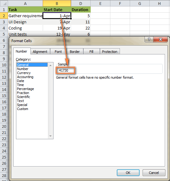
- Right-click on the first Start Date in your data table, select Format Cells > General. Write down the number that you see - this is a numeric representation of the date, in my case 41730. As you probably know, Excel stores dates as numbers based on the number of days since 1-Jan-1900. Click Cancel because you don't actually want to make any changes here.
- Click on any date above the task bars in your Gantt chart. One click will select all the dates, you right click them and choose Format Axis from the context menu.
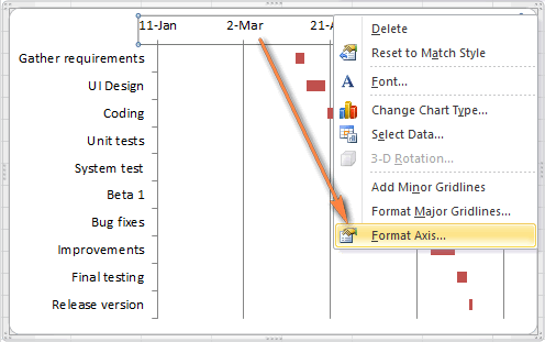
- Under Axis Options, change Minimum to Fixed and type the number you recorded in the previous step.
- Right-click on the first Start Date in your data table, select Format Cells > General. Write down the number that you see - this is a numeric representation of the date, in my case 41730. As you probably know, Excel stores dates as numbers based on the number of days since 1-Jan-1900. Click Cancel because you don't actually want to make any changes here.
- Adjust the number of dates on your Gantt chart. In the same Format Axis window that you used in the previous step, change Major unit and Minor unit to Fixed too, and then add the numbers you want for the date intervals. Typically, the shorter your project's timeframe is, the smaller numbers you use. For example, if you want to show every other date, enter 2 in the Major unit. You can see my settings in the screenshot below.
Note. In Excel 365, Excel 2021 - 2013, there are no Auto and Fixed radio buttons, so you simply type the number in the box.
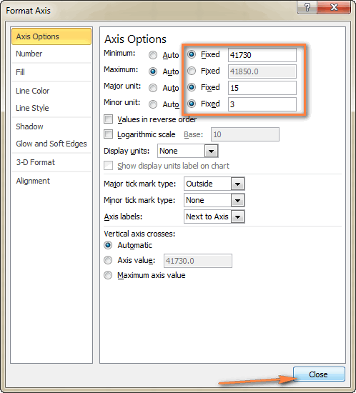
Tip. You can play with different settings until you get the result that works best for you. Don't be afraid to do something wrong because you can always revert to the default settings by switching back to Auto in Excel 2010 and 2007, or click Reset in Excel 2013 and later.
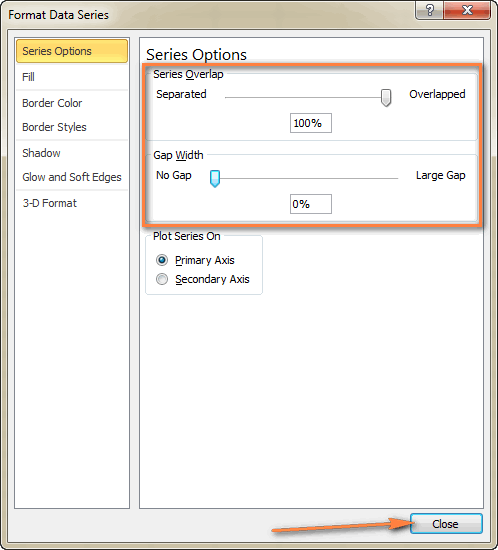
- Remove excess white space between the bars. Compacting the task bars will make your Gantt graph look even better.
- Click any of the orange bars to get them all selected, right click and select Format Data Series.
- In the Format Data Series dialog, set Separated to 100% and Gap Width to 0% (or close to 0%).
And here is the result of our efforts - a simple but nice-looking Excel Gantt chart:
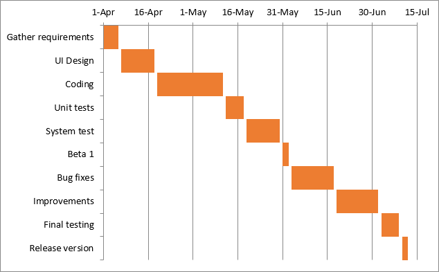
Remember, though your Excel chart simulates a Gantt diagram very closely, it still keeps the main features of a standard Excel chart:
- Your Excel Gantt chart will resize when you add or remove tasks.
- You can change a Start date or Duration, the chart will reflect the changes and adjust automatically.
- You can save your Excel Gantt chart as an image or convert to HTML and publish online.
Tips:
- You can design your Excel Gant chart in different ways by changing the fill color, border color, shadow and even applying the 3-D format. All these options are available in the Format Data Series window (right-click the bars in the chart area and select Format Data Series from the context menu).
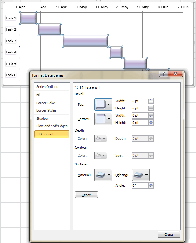
- When you have created an awesome design, it might be a good idea to save your Excel Gantt chart as a template for future use. To do this, click the chart, switch to the Design tab on the ribbon and click Save as Template.
Excel Gantt chart templates
As you see, it's not a big problem to build a simple Gantt chart in Excel. But what if you want a more sophisticated Gantt diagram with percent-complete shading for each task and a vertical Milestone or Checkpoint line? Of course, if you are one of those rare and mysterious creatures whom we respectively call "Excel gurus", you can try to make such a graph on your own, with the help of this article: Advanced Gantt Charts in Microsoft Excel.
However, a faster and more stress-free way would be using an Excel Gantt chart template. Below you will find a quick overview of several project management Gantt chart templates for different versions of Microsoft Excel.
Gantt chart template for Microsoft Excel
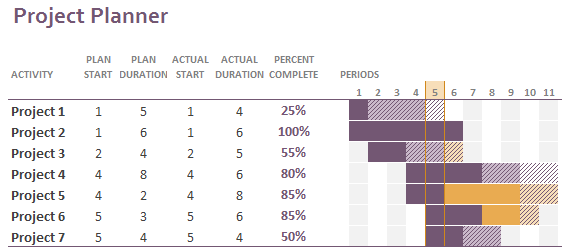
This Excel Gantt chart template, called Gantt Project Planner, is purposed to track your project by different activities such as Plan Start and Actual Start, Plan Duration and Actual Duration as well as Percent Complete.
In Excel 2013 - 2021, just go to File > New and type "Gantt" in the Search box. If you cannot find it there, you can download it from Microsoft's web-site - Gantt Project Planner template. This template requires no learning curve at all, simply click on it and it's ready for use.
Online Gantt chart template
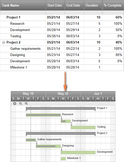
This is an Interactive Online Gantt Chart Creator from smartsheet.com. As well as the previous Gantt chart template, this one is fast and easy-to-use. They offer 30 days free trial, so you can sign with your Google account here and start making your first Excel Gantt diagram online straight away.
The process is very straightforward, you enter your project details in the left-hand table, and as you type a Gantt Chart is being built in the right-hand part of the screen.
Gantt chart template for Excel, Google Sheets and OpenOffice Calc
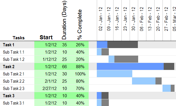
Gantt chart template from vertex42.com is a free Gantt chart template that works with Excel as well as OpenOffice Calc and Google Sheets. You work with this template in the same fashion as you do with any normal Excel spreadsheet. Simply enter the start date and duration for each task and define % in the Complete column. To change the range of dates displayed in the Gantt chart area, slide the scroll bar.
And finally, one more Gant chart Excel template for your consideration.
Project Manager Gantt Chart template
Project Manager Gantt Chart from professionalexcel.com is also a free project management Gantt chart template for Excel that can help track your tasks against their allocated time. You can choose either the standard weekly view or daily for short term projects.
Hopefully, at least one of the above-mentioned templates is suited for your needs. If not, you can create your own Gantt chart as demonstrated in the first part of this tutorial, and then save it as an Excel template.
Now that you are familiar with the main features of the Gantt diagram, you can explore it further and create your own sophisticated Gantt charts in Excel to amaze your boss and co-workers : )
Practice workbook for download
Gantt chart example (.xlsx file)
 by
by
426 comments
How can I put the task name on the rectangles and show their links
Good work, keep it up
Thank you so much for this! It was really, really helpful.
On my side I want to make annual training sport template that will have months and days.
Great article! Very informative, easy to follow and understand, and the graphics helped tremendously! It's one of the best articles I've found on the web about creating a Gantt chart. Thanks!
Is there anyway to have a start and end date column but have some logic that if the end date is blank only 1 cell is populated?
I can understand if you want to display multiple days in a single row having a start and end date, but its annoying needing to put an end date for a single day.
Thanks, this is really helpful for the beginner.
How to draw a PERT Chart that is having subtasks or to forward Gantt Chart to PERT Chart?
Thank you So much for Share Grant chat and My project is smoothly completed So may thank you.
You are helping me alot to get my project done.
Thank you so much.
From Papua New Guinea.
Hi Svetlana, Brilliant, just brilliant. I have no other adjective to describe you. Thank you for your time and generosity.
Kind regards,
Geoff.
Thank you. This was so helpful. Can we keep no. of months instead of dates?
Thank you. This was so helpul.
Thank you so much. You have just saved my life
Wow..this is amazing, you have no idea how much you have helped me out. Thank you so much
One question, would it be possible to add a straight line, as some sort of DEADLINE/CUTOFF in the excel gantt?
I saw this: https://www.ablebits.com/office-addins-blog/add-vertical-line-excel-chart/
Tried to add that in this gantt excel wo any success :'(
How can I make the planned duration a date and not a number?
Hello!
I recommend reading this guide: Convert date to text in Excel.
I hope my advice will help you solve your task.
This is great. Thank you very much.
Thank you very much for this.
At least you have solved one of my technical challenges
Thanks again for work well done
Thank you. This is so well written. I would like to emulate the way you write.
This helped so much thank you!!
Thanks. This was helpful article. You delivered it like a teacher?
Is it possible to control the color and transparency of the bars with data? For example, I'd like to have a start date and end date, but also a "level of effort" measure to indicate how much time a person will likely spend on a task within the start/end dates.
then if that "level of effort" could be used for the transparency that would ideal.
How do we add a vertical line in the chart with the current date?
Excellent tutorial. I'm using Excel on a MacBook so it's slightly different but easy enough to work out the changes necessary. Don't you just love Excel!
This is fantastic!
Great. Excelactly what I needed.
The tutorial is just clear, useful and has helped me. Thank you
Thank you! These instructions were a tremendous help since I've never built a project schedule. The notes and tips gave me an understanding of the basic components using a spreadsheet to retool it into a visual timeline of the project tasks with just start dates and duration # of days.
I pulled up the Gantt project planner (tool) which may be easier and less tedious formatting than using the Excel Chart Tools in the spreadsheet.
Hoping to create a final version in MS Teams Planner, but need to learn how it works.
I went from never hearing about a Gantt chart today (familiarity part of job criteria) to your wonderful details. I have bookmarked this for future reference - amazing this is almost 7 years old and as I notice I am not the only one this year complementing you on this post. thank you
Thank you so much. I wasted two hours watching Youtube just for the gantt chart but, damn, wish I had seen this article earlier. Great content guys. thankyou again.
Great explanation and easy to follow. Managed to create a great Gantt chart at 4.am on a night shift.
Cracking!
Provided Information is very helpful wrt start Date and End Date.
I would like to know that Is there any way to create this GANT Chart based on the hours/day? I am working on a O&M project and i need to know through Gantt Chart that how many itmes /equipment run in series, so that we could calculate the power in hourly basis.
Thanks
Hi Svetlana,
Thanks ever so much for putting together this brilliant tutorial on Gantt Chart.
God richly bless you.
This was a life saver! Thank you and be blessed!
All I can say is thanks and God bless you!
Thank you SO SO SO SO SOOOOOOOOO much for posting this guide. I have been clicking on countless links that gave me absolutely nothing! And after about 10 hours of searching, I finally came across your post and my gantt chart is now complete.
Thank you forever!
Will be pleased if you reconsider the computation of the "duration" as used in your example above. it should be ((end date - start date) + 1).
Hi Maggie,
That sounds very reasonable, thank you! I've added your formula for the duration to the corresponding section.
This is an absolute lifesaver. Thank you so much for this tutorial. Most excellent. Learned something new that I will use for the rest of time. :-)
Thanks! excellent tutorial, clear and easy to follow.
Thanks, this tutorial saved me a lot of time ?
Thanks for this information. I will try and practice it on my own. Never knew one could create a Gantt chart from Excel
One of the best way, it is explained. Thanks
Hi,
Great solution. Thanks.
I wanted to add the end date to chart itself, how can I do that?
You're a life saver. Thanks a lot.
Great Stuff!!
Your teachings are good . Well done. I don't know why my chart is of equal length and it doesn't show the duration length,
Thanks
THIS is exactly what I needed!! Thank you for spelling it out so anyone can understand and follow along. Much appreciated!
Thank you for this. I couldn't follow through because at the range selection of edit series dialog for the duration, the range selection buttons look like little upward pointing arrows and to not take me range selection. Where did I go wrong?
Thank you for this. really helpful for a novice.
shaun
0731370322
Is there any way to create this GANT Chart based on the 8-hours day?
Just like we do in MS Project, we put duration (in hrs.) and Start date, and Finish date is calculated based on it.
Like If, duration is 8 it should add 2 days to Start date.
Did anyone answer your question? I'm still looking at hourly gannt charts stretched over 3 days.
You can do it by changing the cell format to Date/time so you can see the time.
Also change the duration cell format to custom [hh:mm] so you will see the accumulated hours between tasks.
Notice that the hours calculated are based on 24 hours a day.