The tutorial explains how to build charts in Google Sheets and which types of charts to use in which situation. You will also learn how to build 3D charts and Gantt charts, and how to edit, copy or delete charts.
Analyzing data, very often we evaluate certain numbers. When we prepare presentations of our findings, we should remember that visual images are much better and easier perceived by an audience than simply numbers.
Whether you study business indicators, make a presentation or write a report, charts and graphs will help your audience to better understand complex dependencies and regularities. That is why any spreadsheet, including Google Sheets, offers various charts as means of visual representation.
How to Make a Chart in Google Spreadsheet
Let's get back to analyzing our data on sales of chocolate in various regions to different customers. To visualize the analysis, we'll use charts.
The original table looks like this:
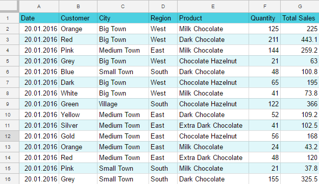
Let's calculate the sales results of particular products by months.

And now let's present numerical data more clearly and concisely with the help of a graph.
Our task is to analyze the dynamics of sales using column charts and line charts. A bit later we will also discuss research of sales structure with circular diagrams.
Select a range of cells for building your chart. The range should include headers of lines and columns. The headers of lines will be used as indicator names, the headers of columns - as names of indicator values. Besides the amounts of sales, we should also choose ranges with the types of chocolate and with the months of sales. In our example, we select the range A1:D5.
Then choose in the menu: Insert - Chart.
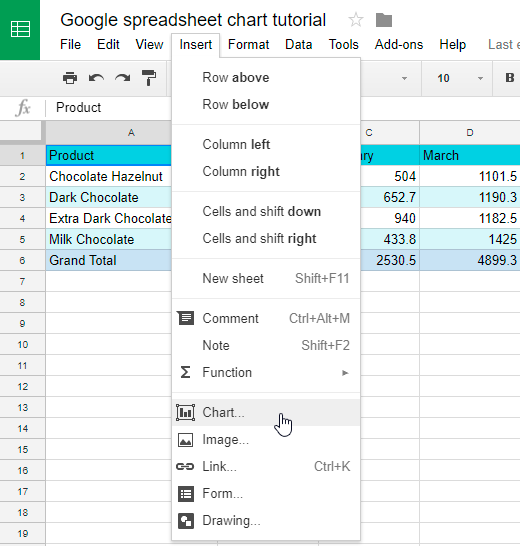
The Google Sheets graph is built, the chart editor is displayed. Your spreadsheet will offer you a chart type for your data at once.
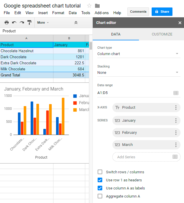
Usually, if you analyze indicators which vary over time, Google Sheets will most probably offer you a column chart or a line chart. In cases, when data is a part of one thing, a pie chart is used.
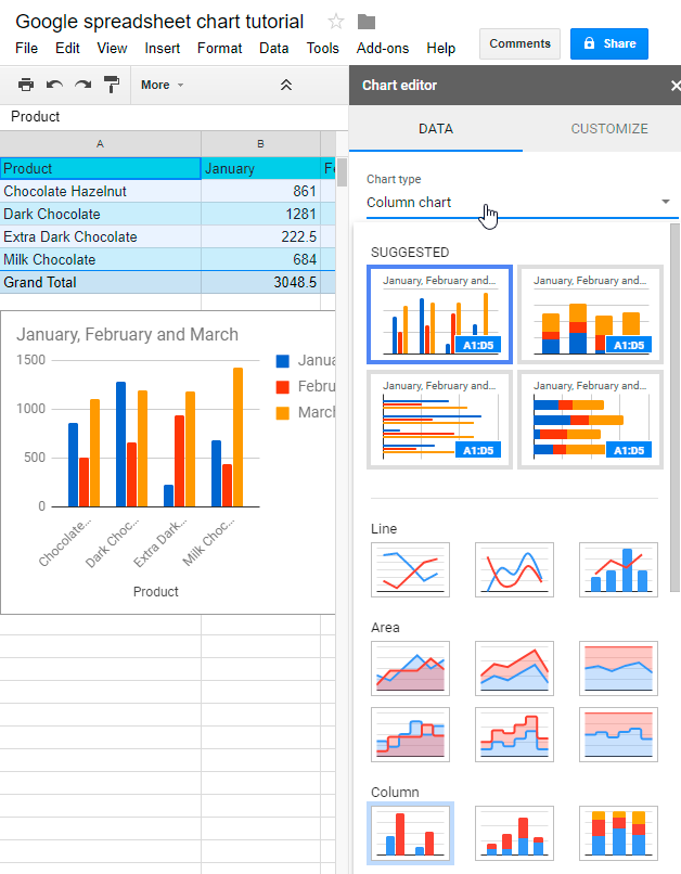
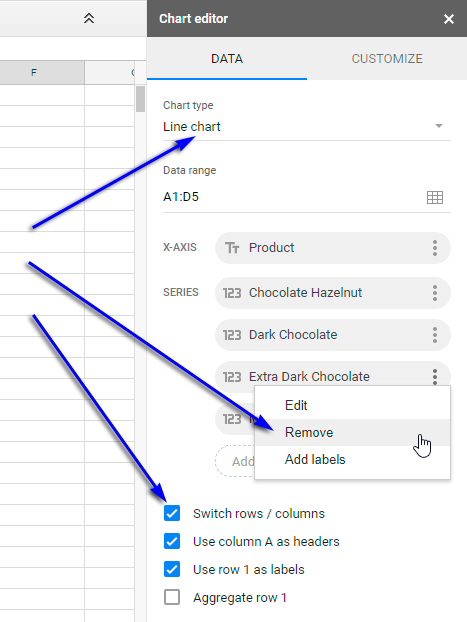
Here you can change the type of the scheme according to your wish.
Besides, you can change the chart itself.
Specify, which values you would like to use along the horizontal axis.
There is an option to switch rows and columns in a chart by ticking an appropriate checkbox. What is it needed for? For example, if in rows we have names of our goods and sales volumes, the chart will show us sales volume on each date.
This kind of chart will answer the following questions:
- How did the sales change from date to date?
- How many items of each product were sold on each date?
In these questions, a date is the key piece of information. If we change the places of rows and columns, the main question will turn into:
- How the sales of each item were changing over time?
In this case, the main thing for us is the item, not the date.
We can also change data, used for building the chart. For example, we want to see the dynamics of sales by months. For this let's change the type of our chart to a line chart, then swap rows and columns. Suppose we are not interested in Extra Dark Chocolate sales, so we can remove these values from our chart.
You can see two versions of our chart in the picture below: the old one and the new one.
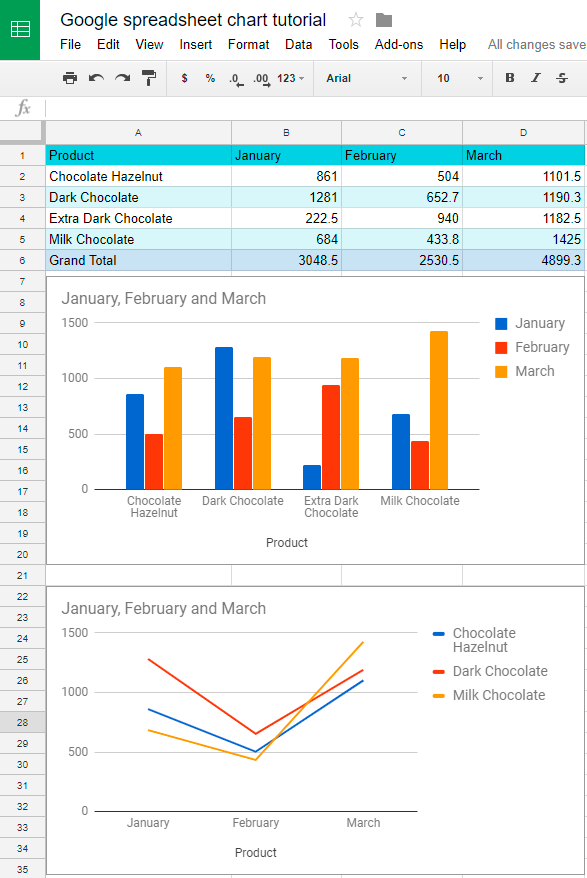
One can notice, that rows and columns have changed places in these charts.
Sometimes, in the range you've chosen for building a graph, there are filtered or hidden values. If you want to use them in the chart, tick the corresponding checkbox in Data Range section of the chart editor. If you are going to use only visible on the screen values, leave this checkbox empty.
After defining the type and contents of a chart, we can change the way it looks.
How to Edit Google Sheets Graph
So, you built a graph, made necessary corrections and for a certain period it satisfied you. But now you want to transform your chart: adjust the title, redefine type, change color, font, location of data labels, etc. Google Sheets offers handy tools for this.
It is very easy to edit any element of the chart.
Left-click the diagram and on the right, you will see a familiar chart editor window.
Choose Customize tab in the editor and several sections for changing graph will appear.
In the Chart Style section, you can change the background of the diagram, maximize it, transform straight lines into smooth, make a 3D chart. Also, you can increase or decrease font size and change its color.
Pay attention, that for each chart type different style changes are offered. For example, you cannot make a 3D line chart or smooth lines in a column chart.
Moreover, you can change the style of labels of the axes and the whole chart, select the desired font, size, color, and font format.
You can add data labels to your Google Sheets graph.
To make it easier to see how indicators change, you can add a trendline.
Choose the location of a chart legend, it can be below, above, on the left, on the right side or outside the chart. As usual, one can change the font.
You can also adjust the design of axes and gridlines of a chart.
The editing opportunities are easy to understand intuitively, so you will not encounter any difficulties. All changes you make are immediately displayed on your graph, and if something is done wrong, you can cancel an action right away.
Here is an example of how a standard line chart can be changed: compare two versions of the same chart above and below.
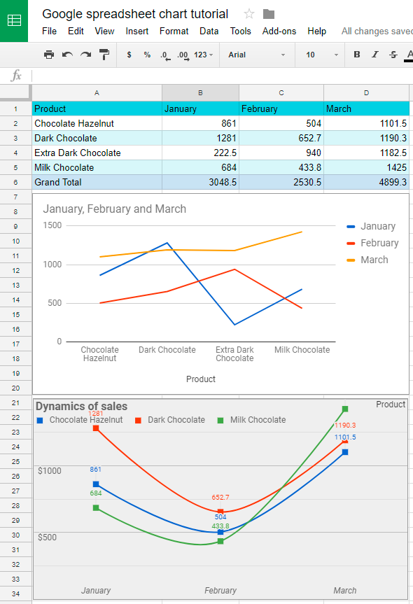
As we see, Google Sheets offers plenty of opportunities to edit charts. Don't hesitate to try all possible options to accomplish your goal.
How to Make a Pie Chart in Google Spreadsheet
Now we will see, how with the help of Google Sheets charts one can analyze the structure or composition of a certain type of data. Let's get back to our example of sales of chocolate.
Let's look at the structure of sales, i.e. the ratio of different chocolate types in total sales. Let's take January for analysis.
As we've already done, let's choose our data range. Besides the sales data, we'll select the chocolate types and the month, in which we are going to analyze the sales. In our case, it will be A1:B5.
Then choose in the menu: Insert - Chart.
The graph is built. If Google Sheets didn't guess your requirement and offered you a column diagram (which happens quite often), correct the situation by choosing a new type of chart - pie chart (Chart editor - Data - Chart type).
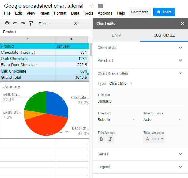
You can edit the layout and style of a pie chart the same way, as you've done it for a column chart and a line chart.
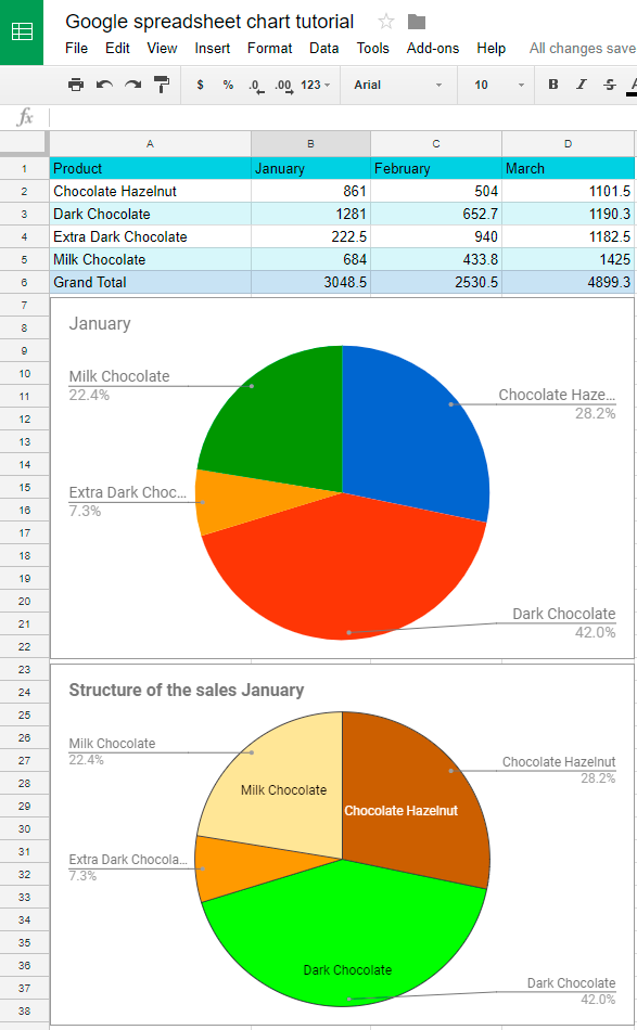
Again, on the screenshot, we see two versions of the chart: the initial and the changed one.
We have added data labels, changed the title, colors, etc. You are free to edit your pie chart as long as needed to achieve the necessary result.
Make Google Spreadsheet 3D Chart
To present your data in a more appealing way, you can make your chart three-dimensional using the chart editor.
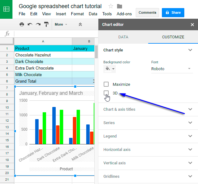
Tick the checkbox as shown in the picture above and get your 3D chart. All the other settings and changes can be applied as it was done before with standard 2D diagrams.
So, let's check out the result. As usual, below are the old version of the chart compared to the new one.
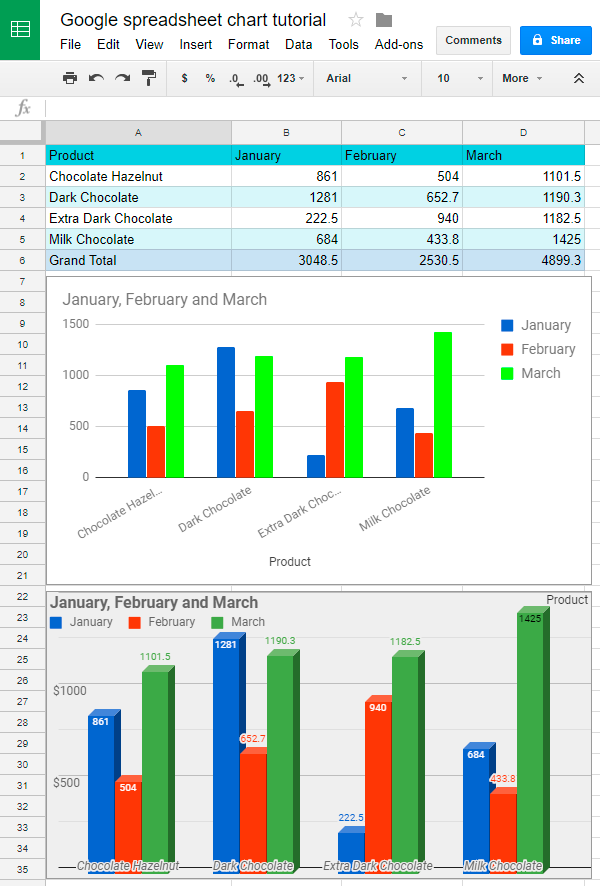
It's hard to deny that now the representation of our data really looks more stylish.
How to make a Gantt Chart in Google Sheets
Gantt chart is a simple instrument to create task sequences and track deadlines in project management. In this type of chart, titles, start and end dates, and duration of tasks are transformed into waterfall bar charts.
The Gantt charts clearly show the time schedule and current state of a project. This type of chart will be very useful if you are working with your colleagues on a certain project, which is divided into stages.
Of course, Google Sheets can't replace professional project management software, but the accessibility and simplicity of the proposed solution are certainly worthy of attention.
So, we have a product launch plan, which can be presented as a dataset below.
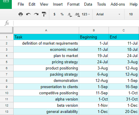
Let's add two columns to our table: the start day of task and task duration.
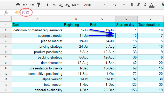
We put day 1 for the start of the first task. To count the start day for the second task, we shall deduct the start date of the whole project (July 1, cell B2) from the start date of the second task (July 11, cell B3).
The formula in D3 will be:
=B3-$B$2
Pay attention that reference for B2 cell is absolute, which means that if we copy the formula from D3 and paste it to the range D4:D13, the reference won't change. For instance, in D4 we will see:
=B4-$B$2
Now let's count the duration of each task. For this we shall deduct the start date from the end date.
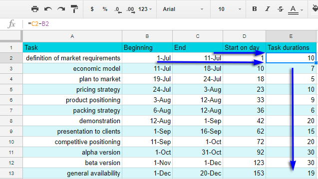
Thus, in E2 we'll have:
=C2-B2
In E3:
=C3-B3
Now we are ready to build our chart.
As you probably remember, in Google Sheets we can use several data ranges to build a chart.
In our case, we are going to use names of tasks, start days and durations. This means that we will take data from columns A, D, E.
With the help of Ctrl key select the necessary ranges.
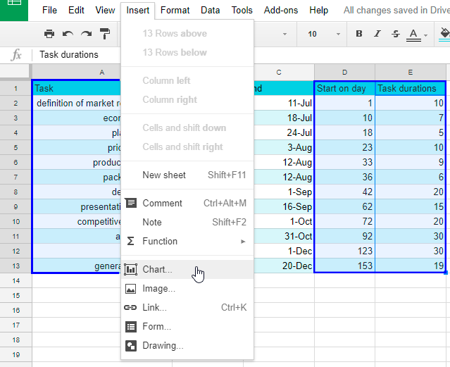
Then as usual go to menu: Insert - Chart.
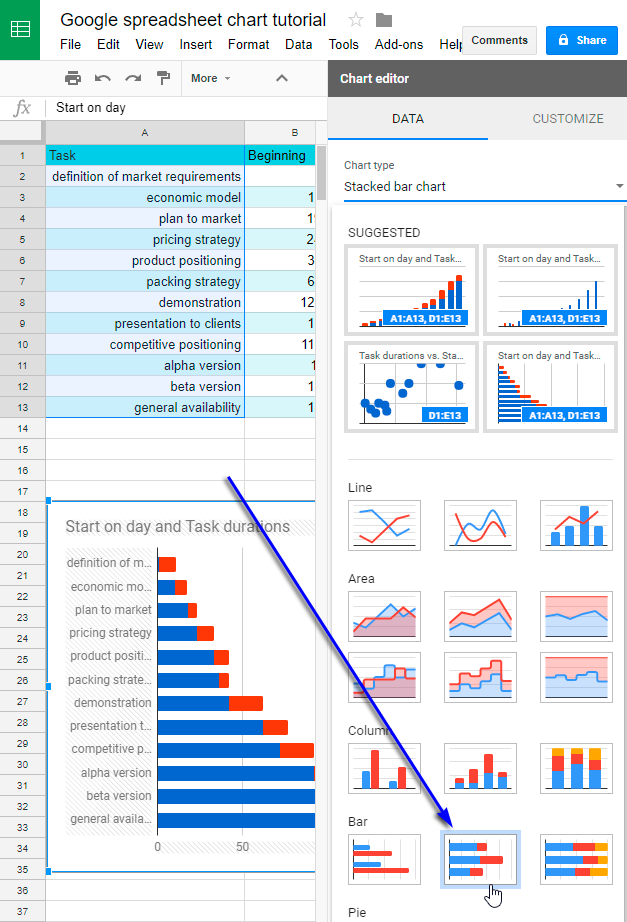
Choose the Chart type Stacked Bar Chart.
Now our task is to make the values in Start on day column not be displayed in the chart, but still be present in it.
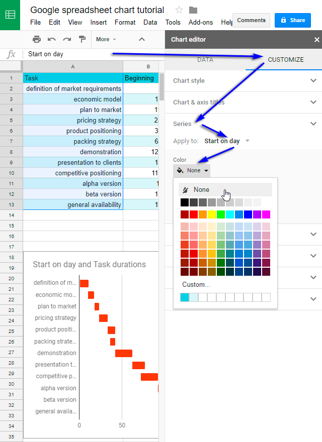
For this we should make the values invisible. Let's go to Customize tab, then Series - Apply to: Start on day - Color - None.
Now the values in Start on day column are invisible, but still, they affect the chart.
We can continue editing our Google Sheets Gantt chart, change the title, location of legend, etc. You are free to make here any experiments.
Have a look at our final chart.
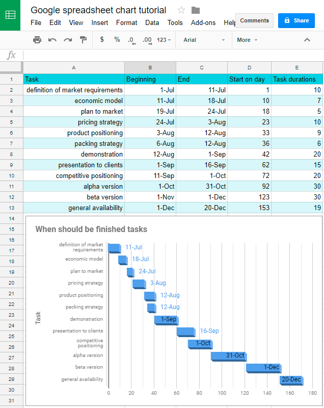
Here one can find the end date of each project stage and sequence of their implementation. Unfortunately, you can't change the location of data labels.
Here are some important tips on working with Google Sheets Gantt chart:
- You can add new tasks and change their deadlines.
- Charts change automatically if new tasks are added or changed.
- You can mark the days on X-axis in more detail, using the chart editor settings: Customize - Gridlines - Minor gridline count.
- You can give access to the chart to other people or give them status of observer, editor or administrator.
- You can publish your Google Sheets Gantt chart as a web-page, which your team members will be able to see and update.
How to Copy and Paste Google Spreadsheet Graph
Click on chart and it will be highlighted at once. In the upper right corner three vertical points will appear. This is the editor icon. Click on it, and you will see a small menu. The menu allows you to open the chart editor, copy a chart or delete it, save it as an image in PNG format (Save image), move a chart to a separate sheet (Move to own sheet). Here one can also add a description of a chart. For instance, if for some reason your chart is not shown, the text of this description will be presented instead.
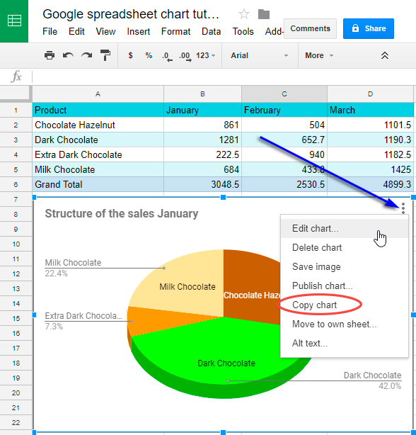
There are two ways to copy a chart.
- Use the described above procedure to copy a chart to the clipboard. Then move to any place on your table (it can be different sheet as well), where you would like to paste your chart. Then just go to Menu - Edit - Paste. Copying is finished.
- Click on a chart to highlight it. Use Ctrl + C combination to copy your chart. Then move it to any place on your table (it can be different sheet as well), where you would like to paste your chart. To insert a chart, use Ctrl + V keys combination.
By the way, in the same manner you can paste your chart to any other Google Docs documents.
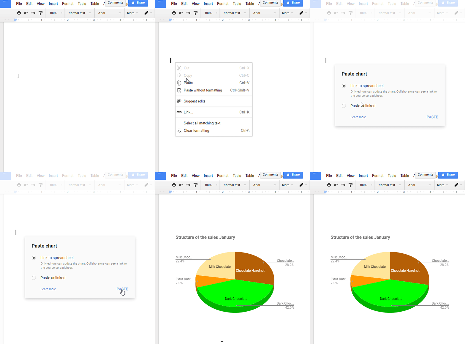
After pushing Ctrl + V keys you can choose either to insert a chart in its current state without possibility to change it (Paste unlinked), or you can save its connection to initial data (Link to spreadsheet). In the second case if you edit the initial chart, its copy on Google Docs will be adjusted.
Move and Remove Google Sheets Chart
To change the location of a chart, click on it, hold down the left mouse button and move cursor. You will see a small image of a hand, and a chart will move with it.
To remove a chart, simply highlight it and press Del key. Also, you can use Menu for that, choosing Delete chart.
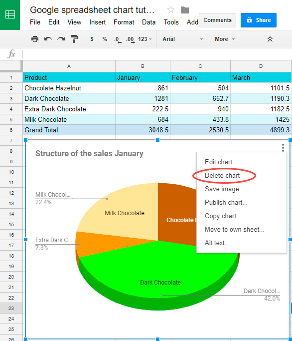
If you have deleted your chart by mistake, just push Ctrl + Z to undo this action.
So now if you ever need to present your data graphically, you know how to do that building a chart in Google Sheets.
Spreadsheet with formula examples
Google Sheets chart tutorial (make a copy of this spreadsheet)
 by
by
48 comments
Hi. I was wondering if you would share the original spreadsheet you used. A copy of it, I mean. I'd love to use your tutorial with my students, but I need a spreadsheet for them to try it in. Thank you!
p.s. Sorry if I missed this mentioned somewhere.
Hi Amy,
Alexander found the spreadsheet and I added a link to it to the end of the blog post (Spreadsheet with formula examples). You can also follow this link to make your own copy of the spreadsheet to your Drive.
Thank you very much for this great blog.
I set up a pivot table in the second tab(sheet) of my two tabs(sheets) table upon the data of my first tab(sheet). In my first tab(sheet) of my table, where I have my "raw" data, I have cells with no value that represents 0 value. I mean, in the cells with value 0 I have empty cells. In the pivot table of the second tab(sheet) Google sheets fills this empty cells with "0" and therefore the line graph I set up with the data of this pivot table draws lines to the floor of the graph to represent this "0" cells.
As you know, there is not possible to delete this "0" value cells in the pivot table. And if I filter them I would be hidden values of the X axis. To format the "0" value cells of the pivot table for not to show the "0" is not working as the "0" value is still there although you can't see it.
Is there a way to sort this situation?
Thank you very much.
Hello Bernhard,
For me to be able to help you better, please share an editable copy of your spreadsheet with us: support@apps4gs.com. Please include your chart as well. I'll look into it and try to help.
Hi,
This is an excellent article. How did you created the final chart showing finish date? I am also creating a similar chart but need to show finish dates.
Thanks
Thank you for you feedback, Rajiv!
Have you tried following the steps from this part of the article? If so, what has gone wrong? What does your chart look like afterwards?
Hello I've been trying to save a table chart for my rrl summary table but everytime I insert a chart it doesn't get all the data in picture. So I can't save it as a picture
Hello Maryb,
Make sure you select the entire data set before inserting the Chart. If something still goes wrong, you can edit the Chart till it looks as you need.
Hi,
I am trying to copy and paste an image onto a bar graph, however, the image wants to adhere to the cell under the graph and not on top of the bar graph.
How do I move the image to the top of the graph?
Thank you!
Hi Lori,
Try using the Google Sheets menu and add image over cells.
i love using google sheet ;3
how do i make a pivot table im rly confused ;-;
Hi,
please check out this article: Google Sheets pivot table tutorial
I am using a pie chart, showing % of "tasks" completed, not started, in progress, or impeded. When I change a status, it updates chart immediately which is all good. The problem is, if I use a filter on another row, say to see how a particular person is doing on executing/completing their tasks and hide the other employees, it seems to break the formula for the overall graph. I then re-populate (select all) the team's names in the filter, and the graph that comes back is either only showing some of the data, or in some cases gone completely.
I notice that if I have "blanks" in some of the rows (which I do) and keep "blanks" selected when I update status or a particular task, the data stays intact and transfers to the chart... If I de-select "blanks" in my filter, and make a change of status of any kind, the chart is either broken or disappears and has to be re-built. Is there a way to lock the graph into the main full document to keep from having to rebuild after each filter action?
Hello Charles,
Open the Chart editor > Setup tab, find 4 checkboxes at the very bottom and tick off the first one – Include hidden/filtered data.
Hi,
I'm using Google sheet a lot. When making a chart is there a way to scale the range from a value in the sheet. F.i. A1:A15 is the normal range. If in the sheet the A15 is not used then the range is A1:A14. So automaticaly change the A15 in A14.
Is that possible????
Greet.
Hi Jaap,
I'm afraid you have to set up the range for the chart manually.
Hello, I'm trying to get my chart to update as the information updates. It's seems like the charts information remains static from the time that it was generated. I'd like it to auto-populate as amounts from the data source change. Any suggestions?
Hello!
The chart is updated automatically as soon as the data has changed. Please describe your problem in more detail. It’ll help me understand it better and find a solution for you. Thank you.
How to rearrange items in the stacked bar graph in Google sheet?
Hello Akhil,
The items are pulled in the order of their appearance in the source table. Just rearrange them in the table and the changes will be applied to the chart as well.
You can also completely reverse the order by these steps:
Thanks for all the info!
I'm working on a Google Sheets with some financial info. The document consists of sheets for each year, i.e. '2019', '2020', etc.
Each sheet has a column with the months of that year '01/2019, 02/2019, etc'.
Each sheet has a chart showing the financial data per month (X-axis = date, Y-axis=amounts).
So far, so good.
BUT; is it possible to set up a chart that uses the dates of multiple sheets as the X-axis? So, I have a chart with an X-axis that starts with 01/2019 from Sheet 1 and continues with 02/2020 from sheet 2?
Thank you!
Hello Boudewijn,
When in Chart editor, click the field Add X-axis. Once you see a window called Select a data range, go ahead and switch to another sheet to highlight the range there. This way, you can add data for other years from other sheets.
Hi there,
I am trying to create an organisational chart but not all of my info has copied into the org chart. Not sure why this is??
Hi Dave,
I'm sorry it's hard to tell what may be causing the issue without seeing your data. Make sure you enter the entire data range for the chart and set all needed labels.
Thanks for a very useful article. The bit I need help on is where you say 'Let's calculate the sales results of particular products by months.' Do you have any tutorials on crunching the raw data like this so that it's ready to be displayed in a pie chart? (i.e. calculating percentage of cells in a column that correspond to a certain value).
Hello,
We covered percentage in Google Sheets a bit in this article. Perhaps, you'll find some paragraphs useful.
hello,
with line chart I have a Number Format issue:
when I activate Series>Data Labels: Number Format in Label match to Format of Data Column/Cells but the Number Format under Mouse on my line chart is not. Why? How to control it under the mouse? - artu
Hello Artu,
I'm sorry, I don't quite understand the problem. For me to get a better understanding, please describe whatever doesn't work in detail. You can also share a small sample spreadsheet with us (support@4-bits.com) with your source data and the result you expect to get. We'll look into it. Thank you.
Note. We keep that email for file sharing only. Please do not email there. Once you share the file, just confirm in this message thread.
I want to insert a table chart into a google slide. Is there any way to make the chart prettier by adjusting colors and row and column size?
Hi Jill,
There is a way to edit your chart. Please look through this paragraph to read more about it.
As for the slides, since we don't work with them, I'm afraid, we won't be able to suggest you anything particular.
Is there a way to change the legend percentage font from grey (default) to black?
Sure.
Right-click your chart and select Chart style. Open the item you want to edit (i.e. Legend, Horizontal/Vertical axis) in the Chart editor sidebar. There you'll find options to change the font and its color.
Please read this paragraph to see what else you can edit in your charts.
When I try to copy my pie chart to a slides presentation (or download it altogether), it comes with a black background. How do I change this? I tried downloading it with no background, and a white background, but it keeps copying and downloading with a black background.
I'm sorry, I'm not able to reproduce this problem. Everything copied and downloaded with a standard white background.
Please try to contact Google Sheets support directly or look for similar problems on their community forums:
https://support.google.com/docs/community?hl=en
I am having trouble making a chart on goggle sheets its separate sheet? Can you help me please?
Click the chart and you'll see three dots at its upper-right corner. Click on them and choose the option to Move to own sheet.
The chart will be inserted into a new sheet next to the one with the source data.
How do I make a combo chart with bar columns and one data set as a line?
Hi, Robin,
I'm sorry, could you please send us an example of the chart you're trying to create? It would help us understand your task better. You can email us to support@ablebits.com with the details.
Thank you.
I built out a very robust query google sheets. I have attempted to create a bar chart but one column is not showing in the chart although I have made sure the formatting of all the cells in the data range is as a number. All other columns in the range are formatted the same and do show data in the chart. Am I missing something? The series in the settings under data tab for the range in which I have an issue show Tt instead of 123 like the others that are displaying accurately. Any help is much appreciated.
Is there a way to copy a Pie chart style from one sheet to the other sheet in the same File?
(I tried Ctrl+C, Edit > Paste format only)- this doesn't seem to work.
Please help.
On the chart created, click the 3 circles spot on the top right of the chart. Then click "move to own sheet". Then the pie chart will be on its own tab in the google sheet. Right click on the newly created tab that is only the pie chart you wanted and select duplicate. Once the tab is duplicated then edit your duplicated pie chart and choose the edit section specifically under the data tab and change the data range to what you desire that is different than your original Pie chart. Formatting should stay the same, etc...
Very Usefull For Me. Tks Mr Alexander Trifuntov
Is there a way to select and deselect data to display in the chart without having to recreate the chart each time?
Hi Jennell,
Yes, it is. As I mentioned earlier, you have to open "Chart editor" by double-clicking on the chart. There is the "Data" tab. There you'll find the "Data range" field which is editable. Just modify it.
BTW, you can change any of chart's properties via the "Chart editor" pane.
Hello, I have been using ggogle sheets for some tiem but there are some things that bother me while making charts: Why cant I use a row for the x axis? Why does google sheets always take my numeric values into series when I want to also be able to use them as the cathegories for the x axis? Why can't I change colors for each bar individually of the bars. These things seem like fairly basic features and it bothers me to no end because I enjoy working with the google working suit and I end up having to slow down , learn why some things don't work and how to overcome them. Feels like putting more work into my work
i just want to know how to get the l e g e n d plzzz
Hi, it's pretty easy.
Do double click on the chart, select the "Customize" tab on the top, open the "Legend" group, select the position, and it will appear!